Deciding Where the Credit Score Simulator Should Live
Before deciding where to place the Credit Score Simulator, I already sensed the biggest challenge wasn’t whether users would like the feature, it was whether they would find it in the right place, at the right time, without it overshadowing more important parts of the app.
Our goal was to:
🎯 never overshadow core experiences like Credit Score Check and Credit Insights.
🎯 make the feature easily discoverable,
There was another important layer to this decision, this feature was especially designed to improve retention and engagement among users who buy the Olyv Plus subscription, so its placement had to support this business goal too.
Our first idea was to place the simulator right on the home screen. It sounded exciting because it would definitely catch attention and drive engagement.
Option 1 : Home Screen
Option 2 : Olyv Plus Membership Page

But here came the first hint of a problem❌…
Even though the home screen placement could increase engagement, it didn’t actually contribute to retention for Olyv Plus subscribers, which was the key purpose of the feature. The placement wasn’t aligned with the subscription journey and I knew we weren’t done yet.

Next, we considered placing the simulator inside the Olyv Plus page, right below the credit score and insight details.
On the surface, this felt perfect. When users tap the feature, they immediately see a popup asking them to purchase the Olyv Plus subscription, making the simulator feel like a benefit that can be unlocked.
And that worked wonderfully in theory.
Option 3: The Final Placement
That realization pushed us to explore our third and final option. Instead of placing the simulator first, we decided to prioritize every core Olyv Plus benefit, such as Credit Score Check and Insights, before the simulator. Only after these essentials comes the Credit Score Improvement Simulator.

Imagine a user who has already purchased the plan and now loves using the simulator regularly. Because it sat right at the top of the Olyv Plus page, that user might keep coming back only for the simulator, and miss out on other important subscription benefits that also deserved attention. Suddenly, the placement meant to improve retention could unintentionally hide other features meant to create value.
But my thought went this direction💭🤔
This placement achieved exactly what we needed:
✨the simulator stays visible
✨it supports subscription retention and engagement
✨it never overshadows the most important parts of the membership experience

Here’s how this plays out across different User situations

Use Case 1
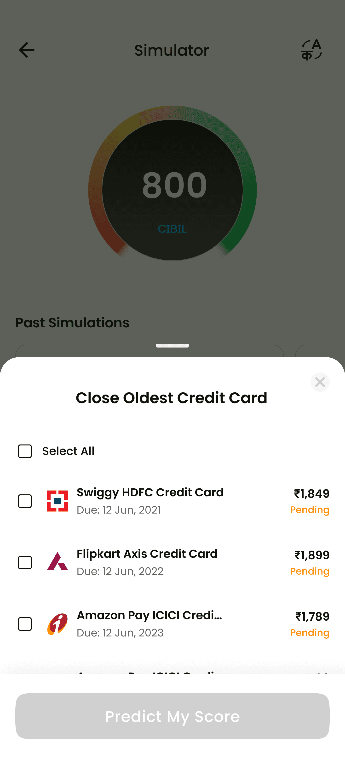
Close oldest credit card
User clicks on the option "Close oldest credit card", then a bottom sheet opens up, where all the credit cards are listed and they can select the checkbox/s to close the credit card. Then user can simulate to see the resulting score by clicking on the CTA.

Use Case 2
Missed Payment for All Accounts
User clicks on the option, then a bottom sheet opens up, where all the accounts are listed and all the accounts are pre-selected. User can choose between how many days the EMI payments are missed. 30,60,90 are the options. Then user can simulate to see the resulting score by clicking on the CTA.
Use Case 3
Pay off All Credit Cards
User clicks on the option, then a bottom sheet opens up, where all the credit cards are listed and all are pre-selected. Then user can simulate to see the resulting score by clicking on the CTA.
Use Case 4
Apply for New Credit Card
User clicks on the option, then a bottom sheet opens up asking the credit limit for new credit card. Front end validation for Credit Limit should be between 20000 and 1500000. Then user can simulate to see the resulting score by clicking on the CTA.


Use Case 5
Apply for New Home Loan
User clicks on the option, then a bottom sheet opens up asking the credit limit for new credit card. Front end validation for Credit Limit should be between 20000 and 1500000. Then user can simulate to see the resulting score by clicking on the CTA.


Use Case 6
Apply for New Auto Loan
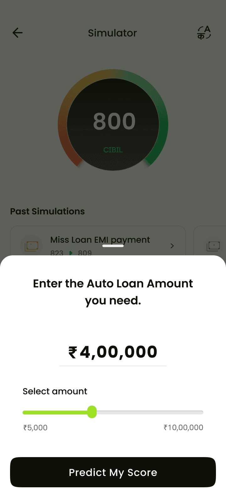
User clicks on the option, then a bottom sheet opens up asking the amount for new Auto loan. Front end validation for Loan Limit should be between 100000 and 2000000. Then user can simulate to see the resulting score by clicking on the CTA.
Use Case 7
Apply for New Personal Loan
User clicks on the option, then a bottom sheet opens up asking the amount for new Personal loan. Front end validation for Loan Limit should be between 5000 and 1000000. Then user can simulate to see the resulting score by clicking on the CTA.

Use Case 8
Add a New Tradeline
User clicks on the option, then a bottom sheet opens up, where two options are listed, credit card or loan. Once one of the option selected, user can simulate to see the resulting score by clicking on the CTA.


Use Case 9
Pay of Outstanding of All Accounts
User clicks on the option, then a bottom sheet opens up, where all the accounts with outstanding balance are listed and all are pre-selected. Then user can simulate to see the resulting score by clicking on the CTA.
Let’s walk through the design process that shaped the final solution.
From research and data, one message stood out:
" Users weren’t aware of the actions that improve their credit score, or the ones that silently damage it. "
To truly understand that experience, I tried stepping into the shoes of our persona: Aisha, a 26 year old young professional who just got her first credit card.
I mapped Aisha’s journey, including her emotions at each stage.

❌Doesn’t understand impact on score
❌Learning through mistakes
❌Damage goes unnoticed
❌No feedback loop
The user didn’t need more credit features, she needed understanding.
Once after defining the problem and finding out all the painpoints, I was ambiguous with one question, Should we teach credit behavior through goals, or help users simulate individual scenarios?
A scenario-based simulation where users explore “What happens if I miss a payment?” making the experience interactive and emotionally impactful.
A goal-based simulation that lets users set a target credit score and receive personalized tips to reach it creating a motivating and action-oriented experience.
Our competitor research showed two contrasting approaches:
Both worked, but something was clearer:
" People are naturally curious about “what if”, and curiosity drives behavior change. "
This insight shaped our direction.
We chose scenario-based simulation because it aligned with:
Our business goals: increasing engagement, session time, and user retention through frequent use 📈
How users think: exploring consequences risk-free 🛡️

I established an initial hypothesis to guide the direction of the design. Later, worked on iterating it. Meanwhile we conducted competitor research.


Gpay
CIBIL


Users got the result, but didn’t feel it, so I redesigned it with dynamic, motion-based interaction to create emotional impact.

Continuing the journey…
Expected Impact (Post-Launch Outcomes)
Although the feature has not yet shipped, we defined clear success metrics and expected outcomes:
Reduced misconceptions around credit score behavior
More responsible credit usage and timely repayments
Increased user trust and engagement with credit-related features
Fewer negative “surprise” score drops reported by users
We planned to validate impact through metrics such as simulator usage, repeat engagement, reduction in late payment patterns, and qualitative feedback from users.
I realized that motion has the power to make users feel something, not just show something. For example, a simple “+10 credit score” update feels informative, but when the dial animates upward and a celebratory confetti burst appears, users instinctively feel rewarded. The animation transforms the result into a moment of achievement, not just data.
Revelation 1: Animation isn’t decoration, it’s emotion
Found this Case study insightful?
Let's Connect

I realized that motion has the power to make users feel something, not just show something. For example, a simple “+10 credit score” update feels informative, but when the dial animates upward and a celebratory confetti burst appears, users instinctively feel rewarded. The animation transforms the result into a moment of achievement, not just data.
Revelation 2: Never stop where the requirements end
Users didn’t care whether it was “Credit Card Simulator” or “Loan Simulator”.
What mattered to them was: “What situation am I currently in?”
The shift from category-based selection to scenario-based selection wasn’t a UI change, it was a mental model shift. Users relate to situations like “Missed a payment” or “Planning to take a new loan”, because that reflects real life, not system terminology.
Revelation 2: People connect more with meaning than with mechanics
Design revelations from the journey